
Case study
Background and Goal
me@ is a mobile app that measures psychological variables and employee engagement, as well as provides scalable interventions for mental wellbeing. The app is provided as a service to organisations and distributed amongst their employees. This people analytics tool is based on a massively successful study, Mappiness.
The scope of this project involved developing a 4 week long interactive and immersive mental wellbeing course from scratch, and revamping the existing measurement interface.
My role in this project was of a product/UX designer, entailed identifying user needs, defining the scope of the product, content creation, and designing the interaction and interface of the app.
Research and Need-finding
The key objective of this project was to design and deliver a mindfulness intervention tool through the me@ app. We started by researching its awareness amongst its potential user. The user group for the app was quite wide. It included 20 yr. old college graduates to 60 yr. old board members of the organisation. We conducted research through user interviews, surveys, along with studying literature.
What we discovered through the research, both qualitative and quantitative, was that not only people were unaware of the work-related stress and its adverse effects on their mental health, but also how mindfulness can help cope with it. Through further enquiry we gained following insights into the user needs —
Armed with these insights and user needs, we further started interviewing stakeholders and domain experts to understand the business and product strategy. In this process, we learned that many research studies, including Mappiness, have shown that happy people are more productive at work. Additionally, mindfulness can help individuals improve their mental health, and in turn their happiness. This meant, and what the company believes in, mindfulness can improve people's quality of life. This evidence based proposition helped focus on the right things throughout the design process.

1. Competitive analysis

Furthermore, we studied the competition and the market. We then chose three products based on similarity for a more detailed analysis. The investigation helped us find the gaps in the market. It also reiterated some the user needs and lack of products on the market to fulfil them.
2. Defining the project
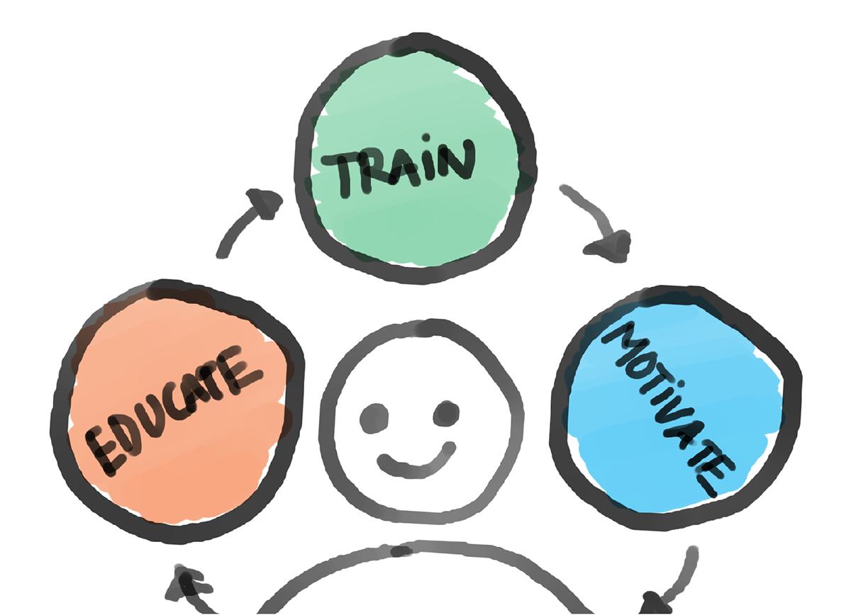
All this research and the insights that emerged from it culminated into a model that both defined the needs, and functioned as cornerstones of the project. At this point the app was decided to be designed as an informative course. The course was then based on three key pillars, 'Educate', ‘Train' and 'Motivate'.
Development
1. Content creation
We began the development phase by researching about and gathering content. This was mainly handled by the in-house domain experts on the subject matter. We started by collecting all sorts of educational and informative material, regardless of its format. This data, then, was formed into different clusters through affinity mapping. The groups that emerged out of this process were—

2. Designing the course
With the themes for the course ready, we started designing the course. The previously identified themes were turned into modules; and their delivery was decided to be on a weekly basis. Subsequently, a framework for the weekly module, based on the 'Educate', Train' and 'Motivate', was established. The course was being designed for novice mindfulness practitioners.
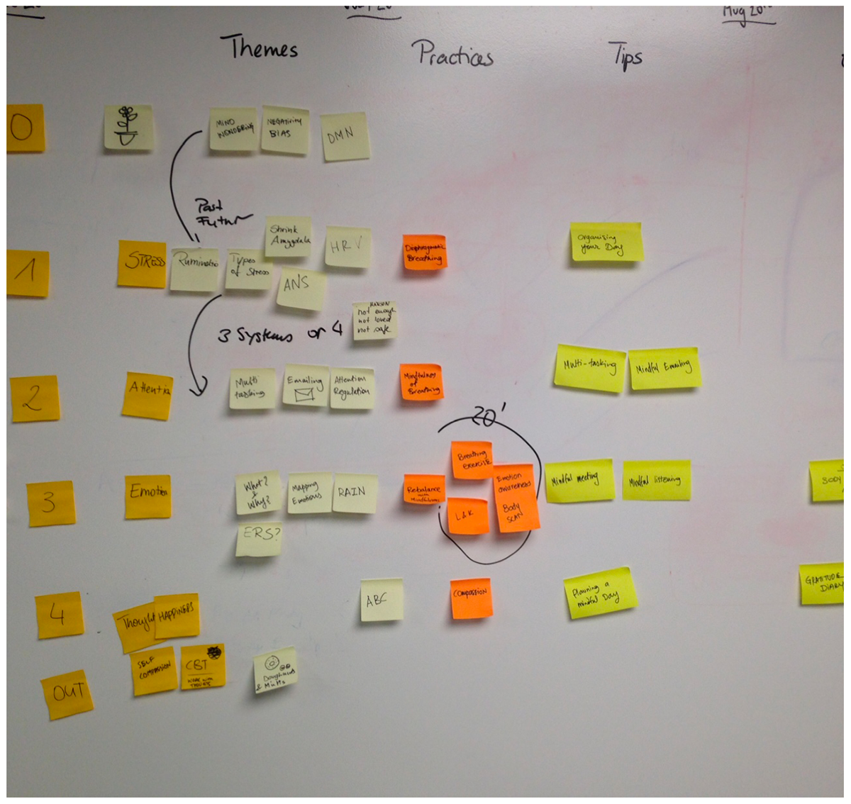
Structure designed for the course
This required the content to be simplified and made engaing. To achieve this we leveraged various ways of communication methods that smartphones offer. The contents of the course included informative videos with animations, interactive practice guides, journals, short-reads, and inspirational material.
3. Initial concepts
This was the point where we started actualising our undertanding and ideas. Some quick dirty paper prototyping was done and revised by the team collectively. Based on testing and feedback a strong contender was chosen for further considerartion and sketched out with little more detailed approach.
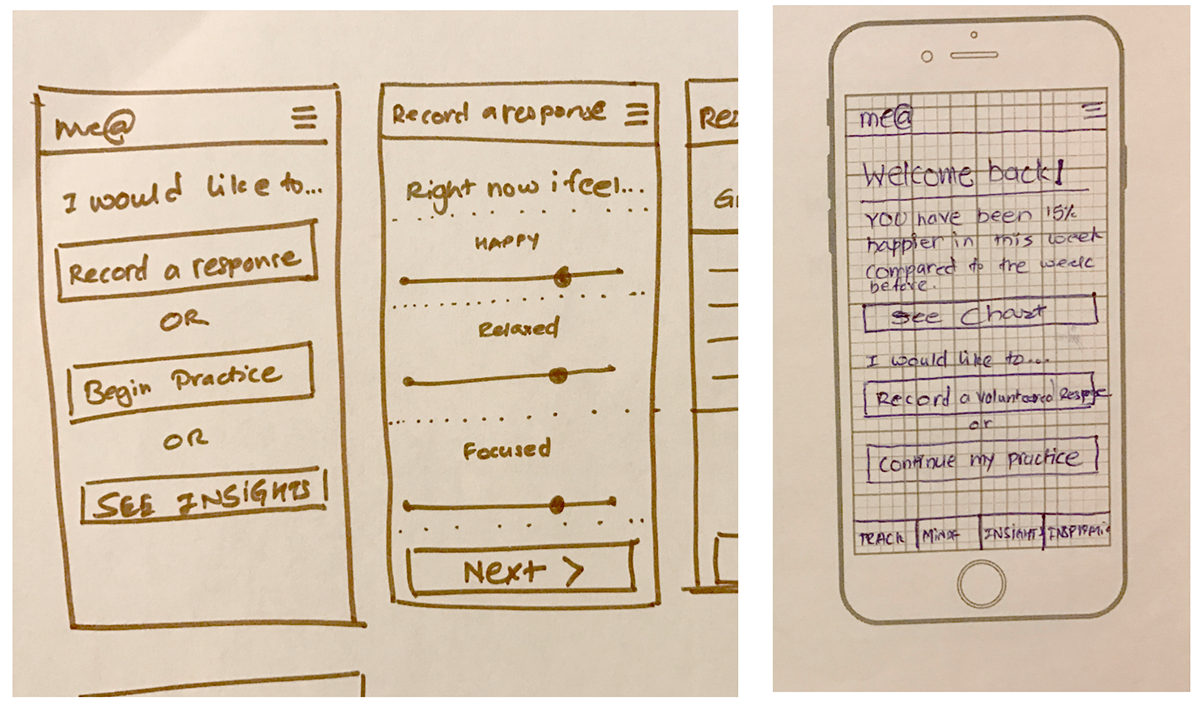
Some initial concept sketches
4. Testing and iterations
The first iteration of the prototype were, then, tested for usability. The key learning from this testing was that users found it difficult to know how to move further in the mindfulness course. So, we started revising the app designs. The new designs were inspired by the 'to-do' list — it made it obvious for the user what action was required.

Initial and revised design
5. Wireframing
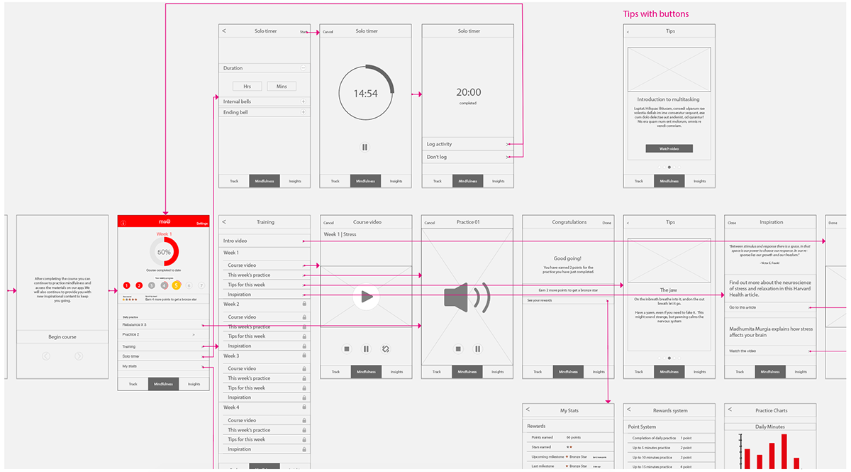
Once we were satisfied with the usability and overall design of the app, we started creating high fidelity wireframes to flesh out the app with minutiae of both, content and interactions.
6. UI and style guide design
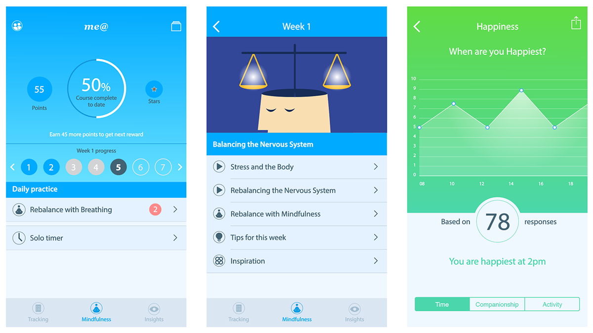
A few final screen designs for the app
In this final phase, visuals were designed for the interface. The app predominantly follows iOS HCI guidelines, however a distinct look with the help of colours, typography, illustrations and iconography was created to lend the app its own unique identity.

Pages from the style guide
Additionally, a style guide for the app was designed. This document included detailed specifications about dimensions, proportions, typography, interactions, iconography, illustrations and overall look and feel of the app.
